Using emotional design to establish the confidence and trust of the viewer.


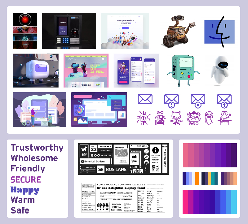
In late 2021 I was given a design prompt for an AI-driven inbox assistant. The client wanted a single page web design and specifically requested an element of emotion and illustration. The client wanted me to create a mascot that the user could trust and love, a creation that could parallel famous campaigns like Geico’s gecko. GIA, or Gremlin Inbox Assistant was the name of the software and it acted like an elevated version of Microsoft’s Clippy. GIA would pop up according to the user’s preferences help the user with important conversations or missed emails, it would also connect to other apps like the user’s calendar and could set reminders and entries.
Of course, giving this level of inbox access to a third-party software is naturally perceived as a risky endeavor or security issue. That’s where emotional design would come into play. I needed to heavily consider how the typography, color, illustration, and flow of this webpage would make the viewer or user feel. They would need to walk away from their visit to GIA’s landing page feeling happy, secure, trusting, and confident. I started the process with typographic research, color theory and moodboarding, eventually landing on the idea for a set of monster or gremlin like creatures that would “live” in the inbox and were ready to come out and help at a moment’s notice.
This process resulted in light gradients of violet, a trusted geometric sans-serif font (Poppins) and some of the fun characters you see below. That, along with an unexpected opportunity to do a significant amount of copywriting led to a successful design. Note the flow of the entire page (you can view this by clicking on any of the three desktop mockups) and how it serpentines all the way down, only broken by a bar of major leading corporations who also trust and use the software. The page ends in some positive reviews and that, combined with every other element really send home the target emotions that the client initially sought out. As the design stands now, the user should feel comfortable, welcomed, and engaged to complete the journey all the way down to the footer. Most importantly, they should feel more trusting in the product than before viewing the design. Further UX testing needed!
Emotional Design
October 2021
Building the identity for a local crime podcast.
Creating the look and feel of a meal-planning app from scratch.
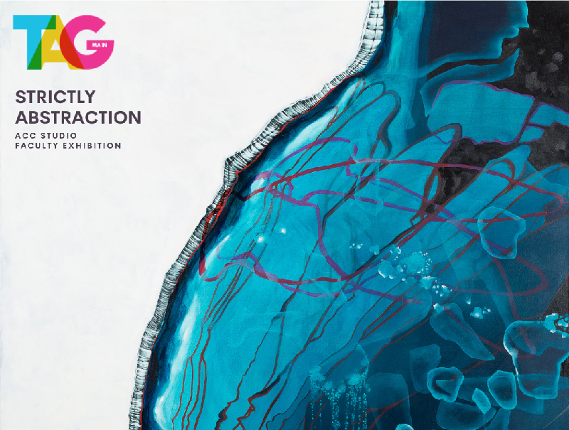
Team based design work for the Art Galleries at Austin Community College.