Building the front-end of a meal planner and recipe database app from scratch.
Just before the beginning of the end of normalcy, I began to meet regularly with a good programmer friend of mine. At the time, he was doing back-end development at a new insurance startup, and just had a baby boy. I had recently started my first semester of Design School. After a few ideation meetings, we agreed to fully commit to building an app from scratch with each other. He would build the entire back-end, I would develop the visual design and hopefully some of the front-end coding as well. We established the core pillars of the app's foundation. It would not only be able to organize a household's weekly meal plan but provide a social community of home cooks and their personal recipes as well. Our goal was to develop this model better than it had ever been done before and more importantly, clout-free. There would be no room in the design for toxicity or scumbaggery.
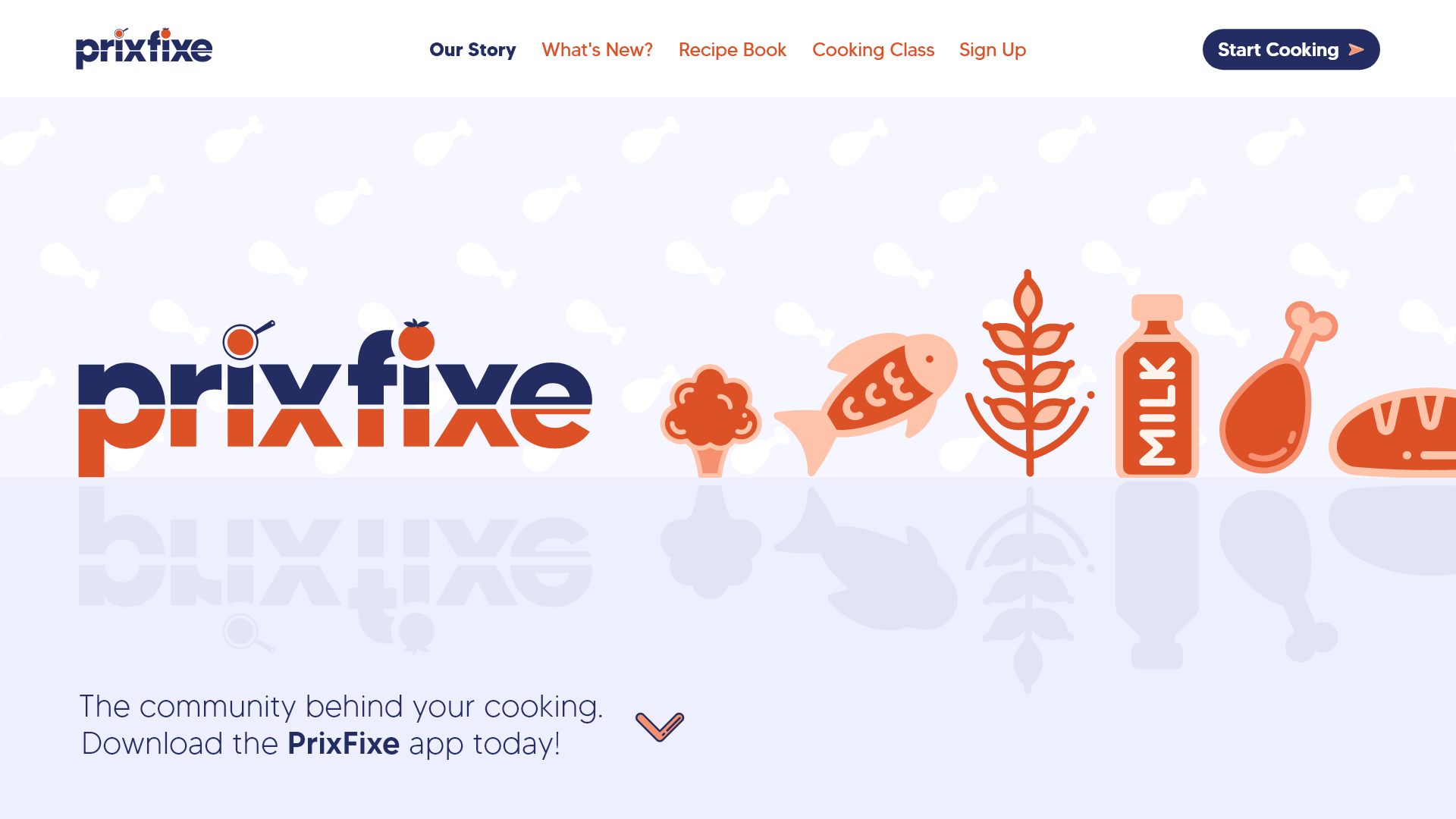
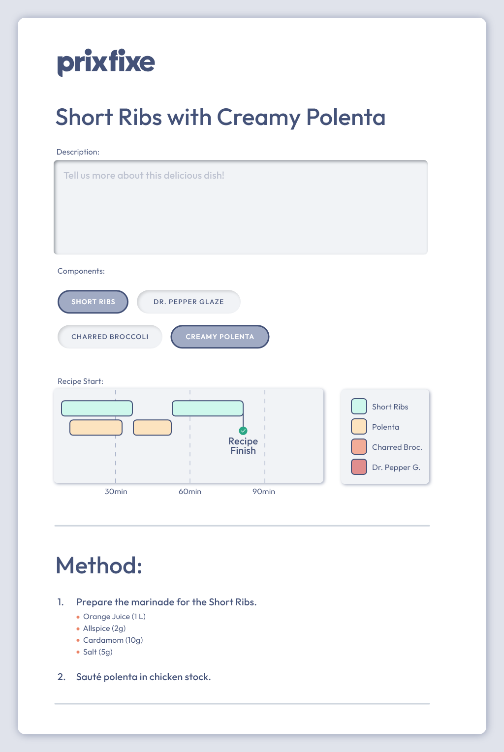
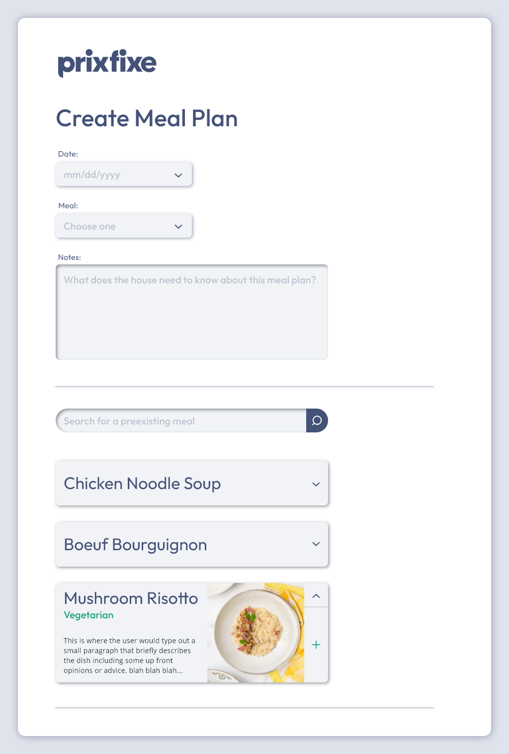
I would be taking a lot from my previous career as a professional chef. Some of the core features and design thinking would stem from an important culinary organizational concept called Mis en Place. Essentially, this means that there is a place for everything, and everything is in its place. This mantra led us to early goals of clean, simple design and clear user journey mapping. The design would also need to be just as helpful and legible on a mobile device as it would on a desktop, responsiveness was a key concern for the front-end development as was the need for a design system/component library.
The beautiful thing about this project was that we had no set time limit. The pandemic kicked off right as we agreed to begin this application adventure and we decided that we would take our time with it, developing a product that was as clean and concise as possible while ignoring shortcuts and MVPs. This allowed me to take a deep dive into concepts like information architecture, responsive design and component libraries, ultimately bringing more to the table than just the visual aspects.
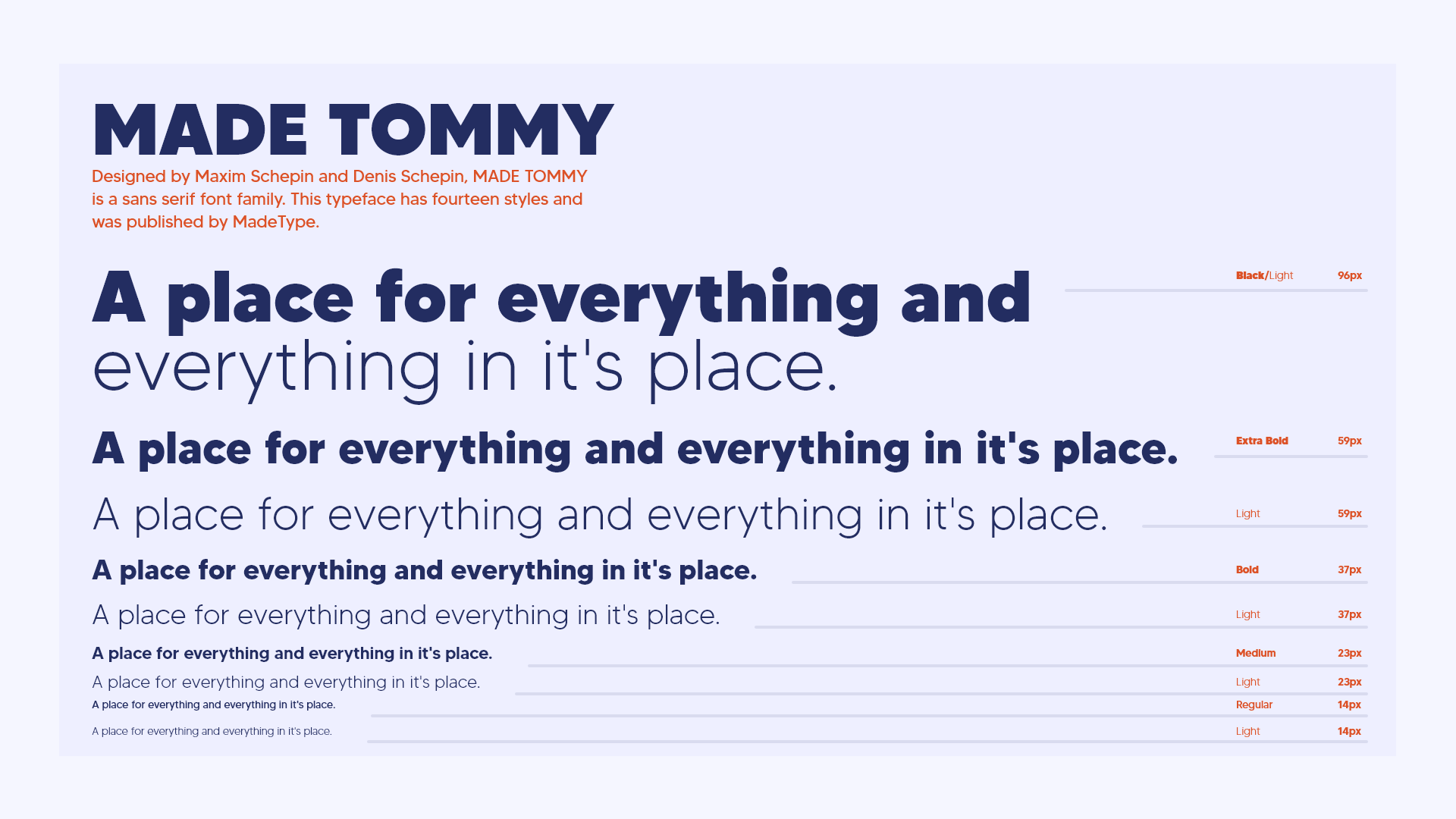
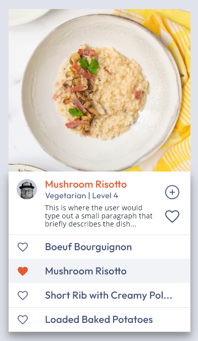
As the project stands today, the entire back-end has been fully developed and is functioning perfectly, we are now beginning to apply my design system to a component library so that the front-end work can begin with a strong foundation. Included on this page are some advert mockups as well as typography work, logo design and hi-fidelity product and interaction design. I am always happy to take a willing viewer on a deeper dive into the design system and how some of the interaction design is going at this point. We look forward to going live so that UX Research can begin, hopefully later this year!
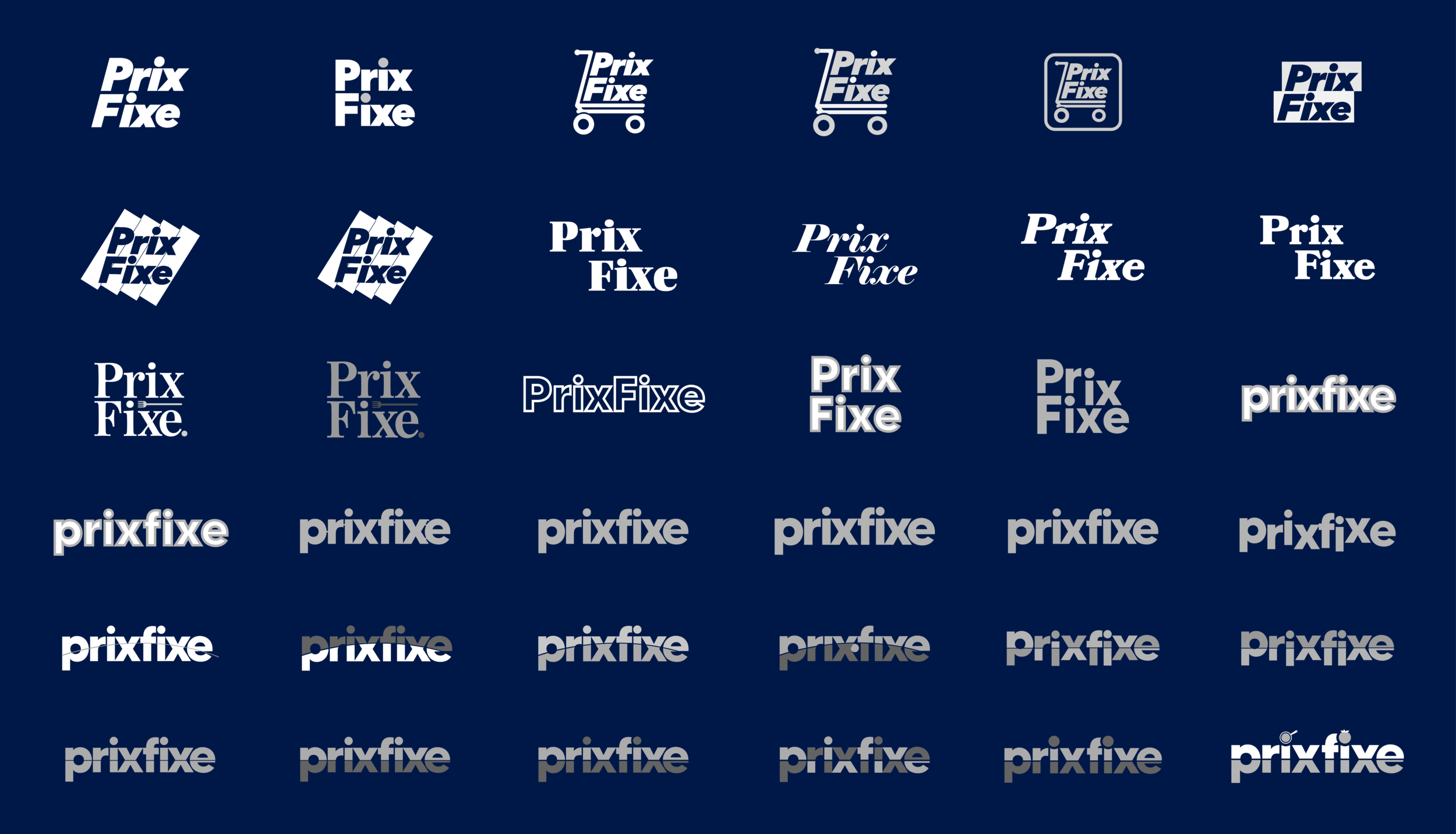
I have worked considerably longer and harder on PrixFixe than any other design work in my career, and that's not a point of pain, but of pride. It is a true passion project for me. As I learned more over the years and became a stronger designer, so did the visual identity of PrixFixe. While every other deliverable in my career has a short deadline, PrixFixe is ongoing, until it's near perfect. Yet, I'm super excited at the thought of continuing designing and improving this app because every lesson I have learned will be applied to this side project at the end of the day. Of course, I hope I get to share the final working product eventually, but until then I'm enjoying this part of the journey as much as I possibly can.
Product & Interaction Design
January 2020 - Present
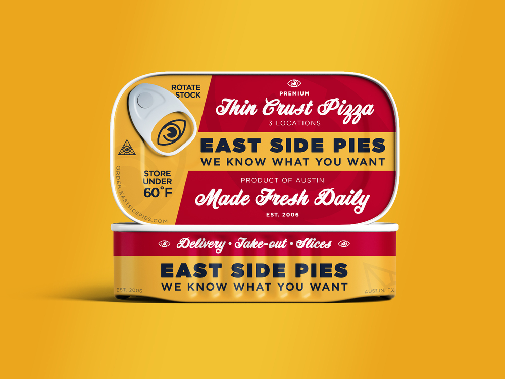
Post Design & Brand Identity work for a small local business in Austin, TX.
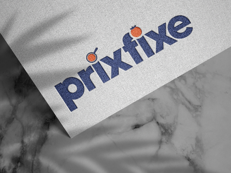
Creating the look and feel of a meal-planning app from scratch.
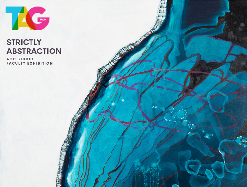
Team based design work for the Art Galleries at Austin Community College.